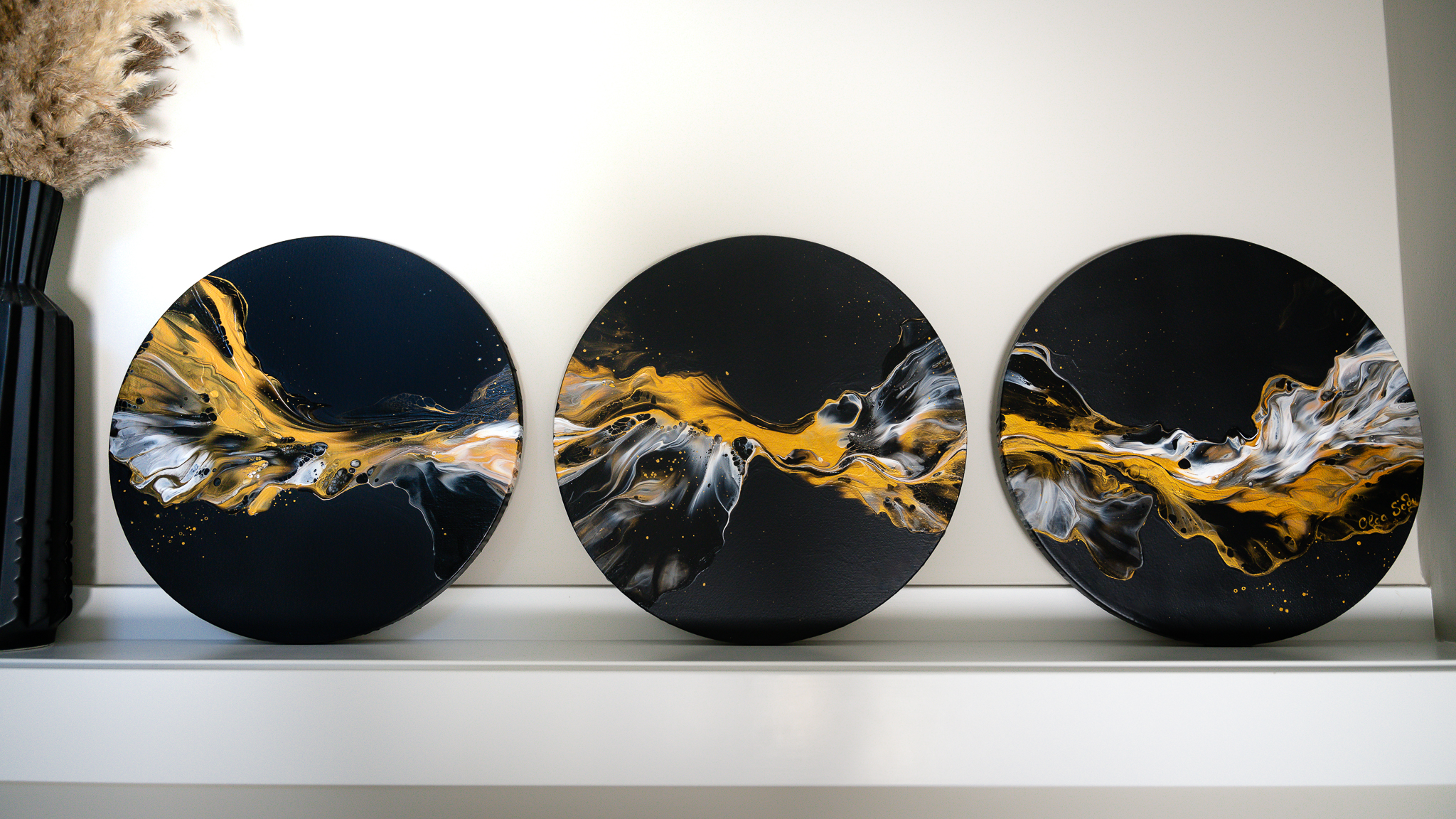
Black, White, and Gold Fluid Art – A Minimal Palette with Maximum Elegance
In today’s world of fluid art, where color explosions are the norm, working with just a few colors can be a bold and refreshing choice.
Black, white, and gold might sound simple – but this palette is anything but boring. It’s timeless, elegant, and perfect for creating bold contrast and high-end drama in your painting.
These colors don’t just look good together – they elevate each other. Gold practically glows against black. White softens and shapes the movement. And black… black creates space, grounding, and visual breathing room.
This kind of palette also works beautifully in modern and contemporary interiors. Whether you're creating a solo painting or – like in today’s video – a cohesive triptych, the result can be clean, powerful, and gallery-worthy.
Tips for Painting with Black, White, and Gold
Before you dive into the video, here are a few tips to help you make the most of this minimal yet impactful palette:
- Embrace Negative Space
Let the black background play an active role in your composition. It highlights your flow, adds contrast, and helps the gold and white pop with clarity. - Balance Metallics with Matte
Using matte black alongside glossy or iridescent gold creates a beautiful contrast in both color and texture. It gives your work an extra sense of depth and movement. - Try a Triptych Format
Painting across multiple canvases, especially round ones, adds a dramatic, immersive feel. It allows your composition to breathe and expand in a unique way. - Use Multiple Golds for Subtle Contrast
Even within a limited palette, you can mix different shades of gold – like metallic and iridescent versions – for richness and a touch of unpredictability in your cell reactions.
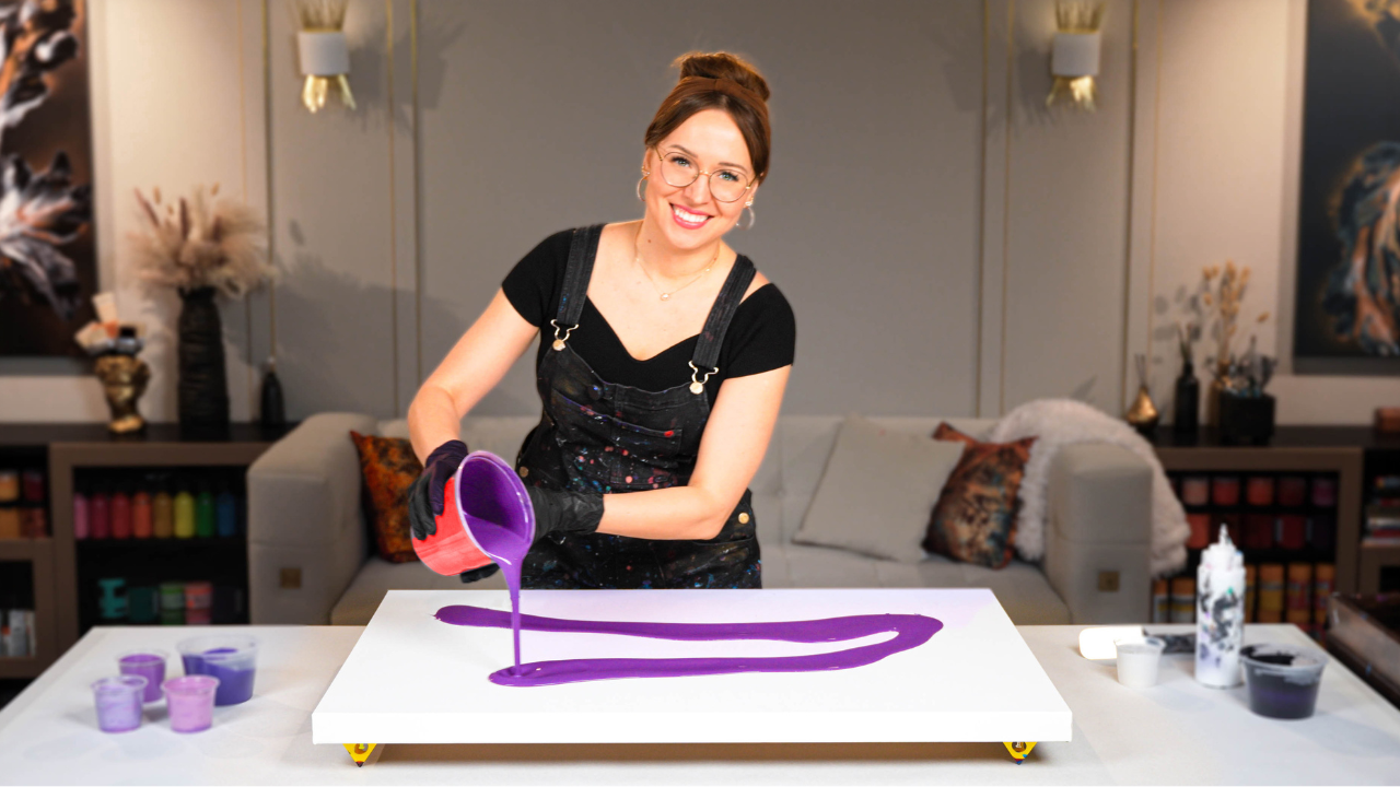
Watch the Triptych Painting Come to Life
In the video below, you’ll see my full process for creating this black, white, and gold fluid art painting. From layering the paints to blowing out the flow across all three canvases, I walk you through each step of the pour:
This project is called “Follow Your Dreams” – a secret message that guided the energy of the entire composition.
Acrylic Pouring Recipe Used
This painting was created using my signature fluid art recipe – an archival, water-based mix designed for optimal cell formation, smooth drying, and consistent performance. I don’t use Floetrol, silicone, or PVA glue in my method, which helps avoid issues like cracking, discoloration, or unpredictable reactions. You can learn more about it in my signature art course.
Give This Color Tri a Try!
If you’re looking for cleaner results and more reliable pours, I highly recommend giving this color combo a try in your next session.
Whether you're feeling bold, introspective, or want a break from the usual rainbow of pigments, exploring a minimal color palette can be a powerful creative reset.
So if you're in the mood to try something different, I invite you to give black, white, and gold a go in your next pour. You might be surprised just how expressive and elegant it can be.
What do you think about this color combination and composition in the final triptych?
Let me know in the comments under the YouTube video – I'd love to hear your thoughts!
Colorfully yours,
Olga Soby
Struggling with paint that’s too runny, too thick, or just not giving you the reaction you want?
You’re not alone — consistency is the #1 challenge I see for fluid artists. That’s exactly why I put together my free Consistency Cheat Sheet. It’s a quick and practical guide that shows you how to mix your paints for different techniques, so you can finally pour with confidence and get results you love.