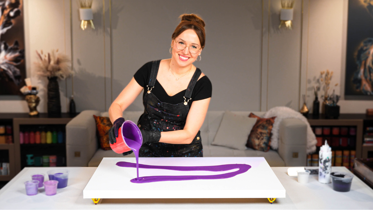
Dance of Early Fall Foliage – Acrylic Pouring Abstract Art 🍃
Get ready for a bold and earthy acrylic pouring project, filled with gemstone-inspired greens and glowing autumn accents.
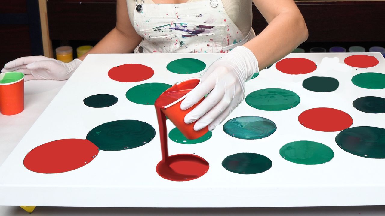
In today’s fluid art tutorial, I wanted to explore the richness of green, combining multiple shades to build soft transitions, depth, and just a hint of drama. I also added red and copper tones to create contrast and movement, like early fall leaves dancing against a lush green backdrop.
Watch the full painting process here:
The secret message behind this abstract painting is “Thrive.” It’s a large canvas (24x30 inches), and I wanted this piece to embody both creative energy and quiet evolution. The layering, the cells, the gentle movement—all of it is a reflection of that thriving energy.
Some of the standout colors in this pour include:
- Phthalo green mixed with Mars black and iridescent blue-green
- Minty metallics made from iridescent pigments and white
- Neutral greens toned with gray
- Deep, moody reds made from carmine, red-violet, and copper
- Titanium white used in delicate lines for contrast
Acrylic Pouring Recipe Used
For this painting, I used my signature Fluid Art Mastery pouring recipe—a carefully balanced water-based formula (around 80%) combined with artist-grade mediums. This blend gives the paint ideal consistency for creating stunning cells, vibrant color transitions, and strong archival quality without using non-archival additives like Floetrol, PVA, or silicone.
Learn the full recipe and my layering techniques inside Fluid Art Mastery
The final result truly reminds me of the Dance of Early Fall Foliage—a soft seasonal shift captured in color and movement. This painting turned out to be my very first fall-inspired pour of the season, and I’m absolutely in love with the subtle layering, glow, and emotion it carries.
Thank you for joining me today! I hope you enjoyed this tutorial and found inspiration for your own fluid acrylic art. Feel free to share your thoughts in the comments below this video.
Colorfully yours,
Olga Soby
Struggling with paint that’s too runny, too thick, or just not giving you the reaction you want?
You’re not alone — consistency is the #1 challenge I see for fluid artists. That’s exactly why I put together my free Consistency Cheat Sheet. It’s a quick and practical guide that shows you how to mix your paints for different techniques, so you can finally pour with confidence and get results you love.