Elegant Flow Acrylic Pouring - Purple Tango Fluid Art
Welcome to a new Elegant Flow Acrylic Pouring abstract art tutorial! Sometimes, fluid art is about bold contrast. Other times, it’s about subtlety, flow, and grace — and that’s exactly what I was after with this painting.
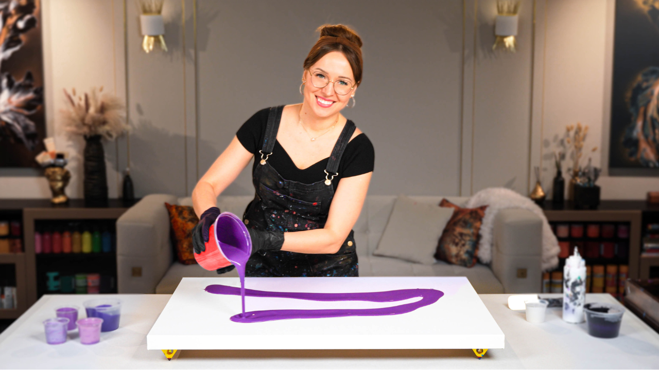
In today’s acrylic pouring tutorial, I’m working with a violet and purple gradient base, creating soft transitions between cool and warm tones, and layering a minimalist gold and white flow on top. My goal was to achieve something both elegant and expressive, where the movement feels effortless but full of intention.
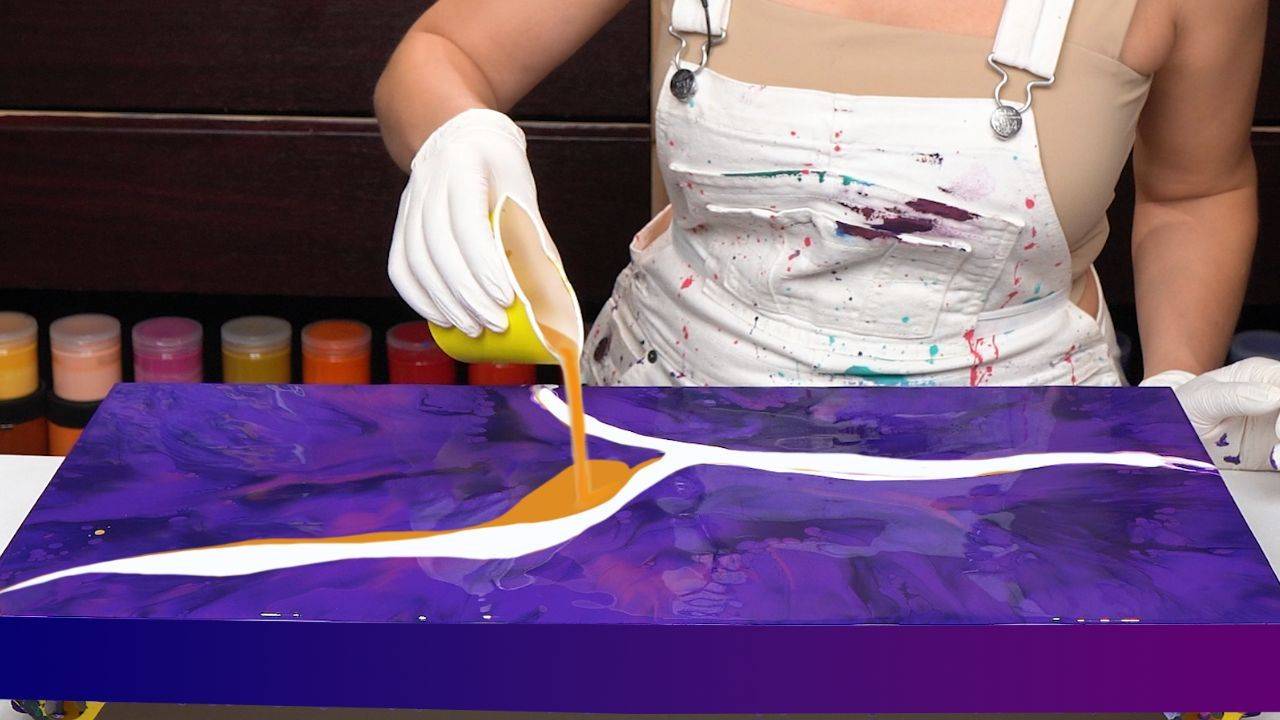
The technique I used is a type of blowout, similar to the Dutch pour, where the white and gold create airy trails and beautiful lacing as they move across the richly layered base.
Watch the Full Painting Process:
See how the violet tones build depth and how the white and gold accents create graceful flow and striking details.
Color Choices and Elegant Layering
I built the base using a variety of violet shades:
- Cobalt violet for its true purple warmth that stays rich even when dry
- Blue-violet blended with a touch of phthalo blue and black to deepen the shadows
- Oriental violet, a slightly warmer and more red-based tone for balance
As I blew out the top layer of gold and white, these purples blended beautifully, creating new shades and soft transitions that make the painting feel dimensional and alive. You’ll also notice clusters of cells and fine lacing forming naturally — a result of the right layering and consistency.
Acrylic Pouring Recipe Used
All paints in this pour were mixed using my signature Soby Recipe, the same formula I teach inside Fluid Art Mastery. It’s a water-based mix (about 80%) combined with artist-grade mediums that improve drying performance, create clean cells and lacing, and keep your artwork fully archival — no Floetrol, no PVA glue, no silicone. This recipe is key to achieving elegant movement without muddiness or cracking.

This painting, titled “Grace”, is a perfect example of how subtle variation in color and thoughtful movement can create something incredibly dynamic. When your base colors are close in tone but layered well, the painting gains a new dimension, and when you add flow with just a touch of contrast, it brings everything together.
Let me know if you felt the grace in this one, and feel free to share your own experiments with purple palettes and elegant fluid art compositions!
Colorfully yours,
Olga Soby
Struggling with paint that’s too runny, too thick, or just not giving you the reaction you want?
You’re not alone — consistency is the #1 challenge I see for fluid artists. That’s exactly why I put together my free Consistency Cheat Sheet. It’s a quick and practical guide that shows you how to mix your paints for different techniques, so you can finally pour with confidence and get results you love.