Ethereal Serenade Acrylic Pour – Deep Blue Abstract Fluid Art
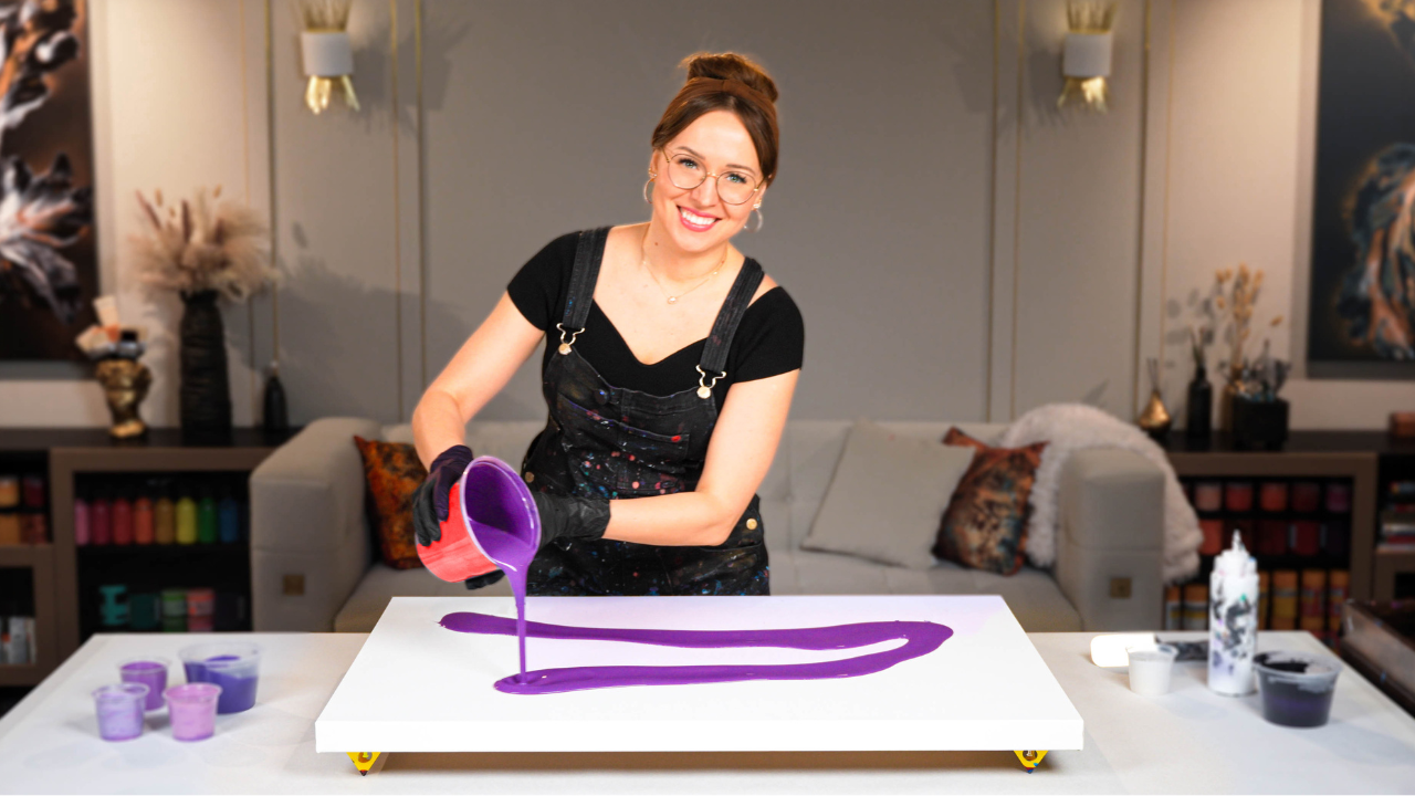
Some fluid art paintings feel like a whisper. Others like a song. This new acrylic pouring artwork, which I call “Ethereal Serenade,” is definitely the latter — a soft yet vibrant symphony of movement on a deep, moody base. I created it using a dark multi-color foundation built from varying blends of blue, violet, white, and black — each color slightly different in tone and mood.
It’s a minimalist fluid art composition, but it carries so much emotion. That dreamy, ocean-night feel was exactly what I wanted.
Watch the Full Acrylic Pouring Tutorial:
Watch the full step-by-step process behind this elegant dancing flow painting.
The Secret Message: Ethereal Serenade
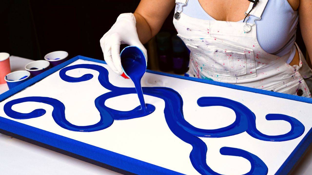
In this painting, I wanted the base to feel like a quiet night — rich and deep — while the top layer would dance like a delicate melody. So I created a graceful flow using:
- White and gold for luminous contrast
- A soft, custom coral-pink made from vermilion and white
- Flowing shapes and negative space to keep the movement gentle and musical
And the base was built from different proportions of phthalo blue, violet, black, and white, resulting in gradients from inky darkness to soft twilight hues.
Acrylic Pouring Recipe Used
All colors in this painting were mixed using my signature Soby Recipe — a water-based pouring formula that I teach in my Fluid Art Mastery course. It’s designed to help you achieve beautiful movement, seamless blending, and clean cells without relying on Floetrol, PVA, or silicone. The finish is smooth, professional, and archival.
“Ethereal Serenade” was a joy to create — a reminder that you don’t need a loud palette to make an emotional statement in fluid art. With just a few well-chosen colors and the right consistency, even a minimalist Dutch pour-style composition can feel layered, expressive, and complete.
If you enjoyed this acrylic pouring tutorial, let me know in the comments on YouTube! I always love hearing how these videos inspire your own creations.
Colorfully yours,
Olga Soby
Struggling with paint that’s too runny, too thick, or just not giving you the reaction you want?
You’re not alone — consistency is the #1 challenge I see for fluid artists. That’s exactly why I put together my free Consistency Cheat Sheet. It’s a quick and practical guide that shows you how to mix your paints for different techniques, so you can finally pour with confidence and get results you love.