
Monochrome Magic: Creating Depth with a Phthalo Blue Color Palette
Working with just one color might sound limiting - but in this painting, I found the opposite to be true.
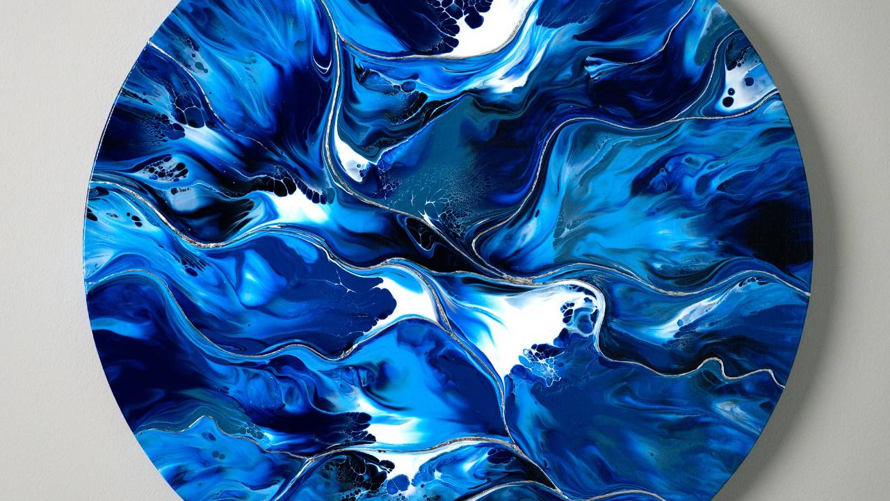
For this round 20-inch canvas, I chose a completely monochromatic palette based on phthalo blue. Every shade was either mixed with black, white, or both to create desaturated, deep ocean-like tones ranging from nearly black to icy sky blue.
My goal was to explore depth, movement, and emotion using only tonal shifts within a single hue — and I have to say, it surprised me how expressive and dynamic the result turned out.
If you've ever felt stuck using too many colors or overwhelmed by color theory, this approach might just set you free.
Watch the Process:
This limited palette gave me the freedom to focus purely on flow, structure, and emotion. The way each version of phthalo blue reacted during the blowout—especially when layered intentionally—created powerful cell reactions and organic shapes that look like clashing waves or a stormy sea.
To emphasize this moody energy, I later added silver leaf embellishment that shimmers like moonlight across the painting’s surface.
Acrylic Pouring Recipe Used
This painting was created using my signature Fluid Art Mastery recipe — designed to produce consistent results, stunning cells, and a beautifully smooth drying finish without Floetrol or silicone.
The base for each blue was adjusted for ideal blowout consistency, allowing clean transitions between lighter and darker tones without overmixing.

This artwork is a reminder that sometimes less is more. By reducing my palette, I was able to tap into a whole new emotional frequency. It’s moody. It’s stormy. It’s serene.
Would you like to see more monochrome ideas like this? Let me know in the comments under the video — I always love hearing from you.
Colorfully yours,
Olga Soby
Struggling with paint that’s too runny, too thick, or just not giving you the reaction you want?
You’re not alone — consistency is the #1 challenge I see for fluid artists. That’s exactly why I put together my free Consistency Cheat Sheet. It’s a quick and practical guide that shows you how to mix your paints for different techniques, so you can finally pour with confidence and get results you love.


