My Favorite Way to Layer Bold Colors in Acrylic Pouring
Working with bold, high-energy colors in acrylic pouring can feel both thrilling and intimidating. Shades like carmine, magenta, red-orange, and violet radiate power, passion, and movement, but they can quickly overwhelm your fluid painting.
One of my favorite ways to make such a palette work is by using gradient color layering. By transitioning from cooler shades into warmer tones, you can create a beautiful harmony and movement.
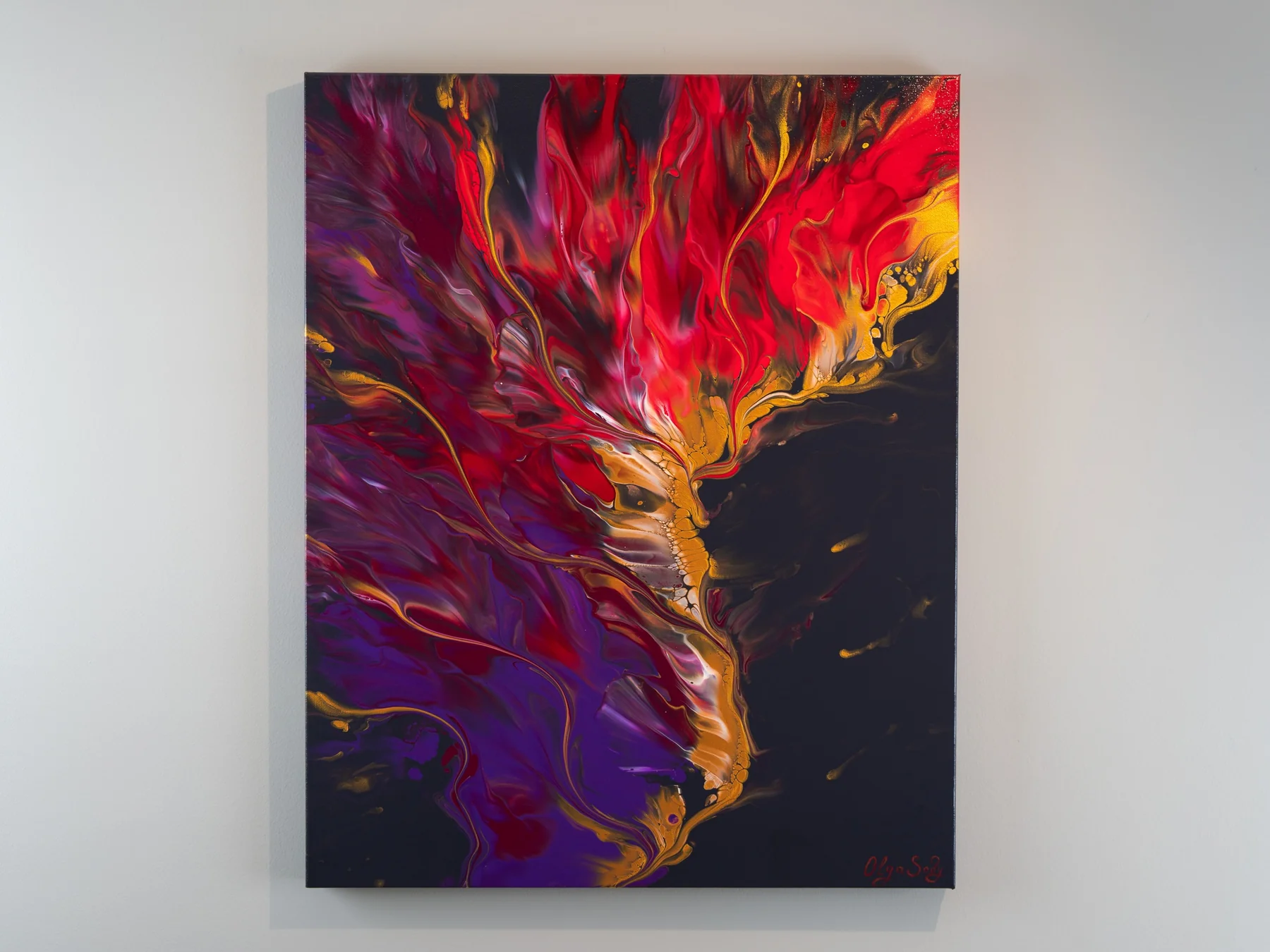
In this painting, I layered a gradient that flowed from cool purples into deep reds and fiery red-orange, then tied it all together with shimmering gold accents and subtle finger swipes. The result? A powerful, rising energy that feels both dramatic and elegant.
Watch the Full Tutorial
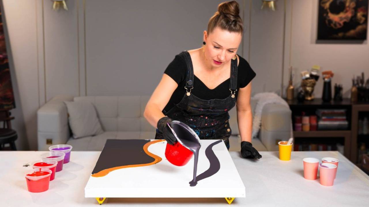
Here’s the full video of this painting process:
Acrylic Pouring Recipe Used
This artwork was created using my Fluid Art Mastery recipe, a water-based formula with a few professional-grade ingredients that ensure smooth layering, strong color vibrancy, and stunning cell formation – without the use of Floetrol or silicone. The recipe is designed for artists who want professional, archival, and consistent results without breaking the bank.
You can learn the full recipe and layering methods inside my Fluid Art Mastery online course
Why Neutrals Matter in Acrylic Pouring
The secret to making bold palettes shine is what you do with the negative space. Neutrals like black, white, deep gray, and warm charcoal act as a balancing stage for your vibrant colors.
For this composition, I created a dark gray base, mixed from black, white, and a touch of red, to ground the entire palette. This neutral backdrop allowed the gradient to glow without becoming overpowering.
If you’ve ever felt that your acrylic pours look “too much,” try experimenting with neutrals. They add sophistication, let the colors breathe, and create striking contrast.
The Magic of Golden Accents
Metallics, especially gold, are my favorite way to elevate fluid art. In this pour, I added fine golden lines throughout the flow, weaving warmth and richness into the composition. Gold is also highly responsive to light, which makes it a perfect complement to deep neutrals.
I named this painting Phoenix's Path:

Finger Swipes for Flow and Dimension
To enhance movement, I incorporated finger swipes. This technique is simple but powerful: it softens transitions, connects different layers of the gradient, and creates dimensional lines that guide the viewer’s eye.
Try Gradient Layering in Your Next Pour!
Working with strong, warm colors becomes much easier when you layer them as a gradient. Let the hues gradually shift – from subtle purples to fiery reds, into vibrant oranges- so the energy of each shade builds on the next.
This not only avoids abrupt clashes but also gives your fluid painting a sense of balance and movement. And don't forget to balance your palette with a neutral negative space.
What do you think of this approach? Would you like to see more tutorials with gradient layering? Let me know in the comments under the video on YouTube – I’d love to hear your thoughts and ideas.
Colorfully yours,
Olga Soby
Struggling with paint that’s too runny, too thick, or just not giving you the reaction you want?
You’re not alone — consistency is the #1 challenge I see for fluid artists. That’s exactly why I put together my free Consistency Cheat Sheet. It’s a quick and practical guide that shows you how to mix your paints for different techniques, so you can finally pour with confidence and get results you love.


