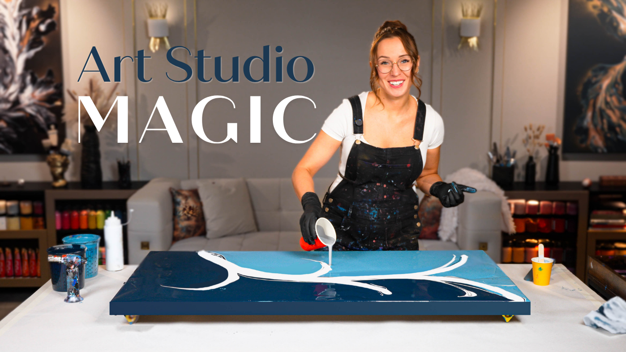
Orange Acrylic Pour Painting Tutorial – High Contrast Fluid Art
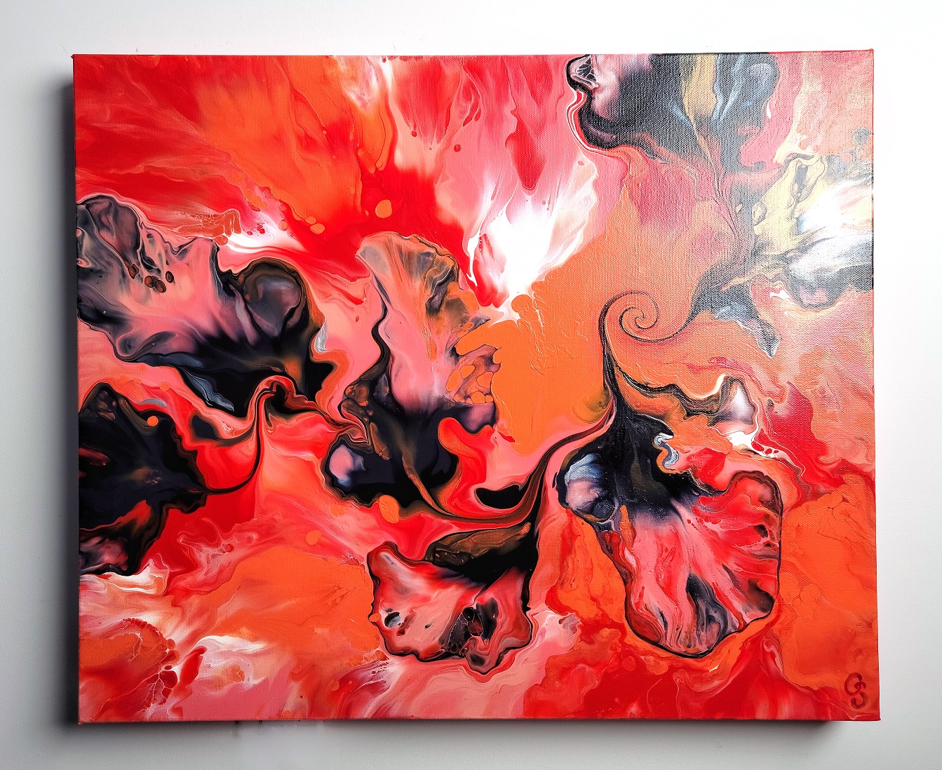
If you're in the mood for warm, fiery colors and bold movement, you're going to love this Orange Pour Acrylic Pouring abstract art tutorial! In this acrylic pour, I explored a vibrant orange color palette with a strong, contrasting black flow. This painting is part of a fluid art series I’ve been creating, each featuring a monochromatic base with a dynamic black accent.
So far, I’ve done one in yellow, one in turquoise, and now… It's Orange’s turn to shine.
Color Strategy in Fluid Acrylic Pouring
Orange is a powerful color – warmer and deeper than yellow, but still brighter than most mid-tones. But here's the thing: if you're working with a medium-dark base and add black over it, the contrast isn't always strong enough. That’s why I chose vermilion orange as my dominant color for this piece. It's vibrant, juicy, and exactly what I needed to make the black flow pop.
The result? A high-energy fluid abstract painting with serious carnival spirit – vivid, joyful, and totally full of life.
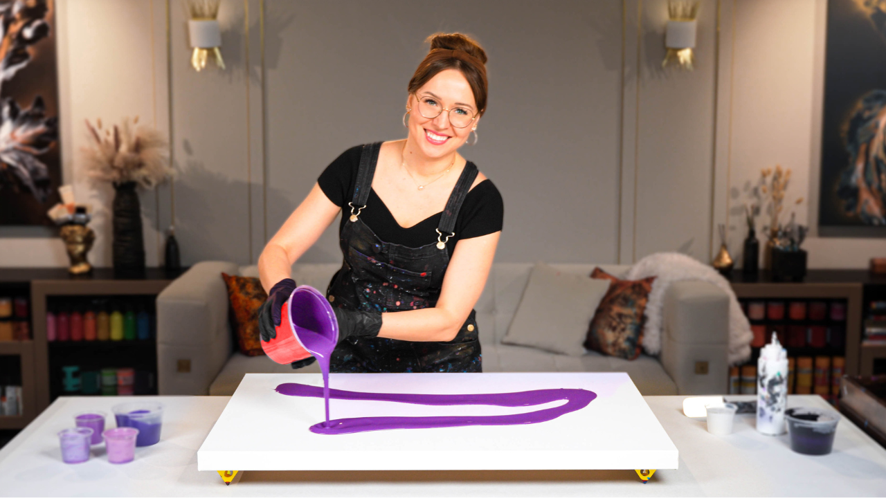
Watch the Full Acrylic Pouring Process:
Acrylic Pouring Recipe Used
To create this painting, I mixed my acrylic colors using my signature Soby Recipe – the exact method I teach inside Fluid Art Mastery. This water-based formula (around 80%) is designed to keep pouring affordable while still delivering professional results. I add a few carefully chosen artist-grade mediums to improve the drying process, prevent cracking or crazing, and help create beautiful cells – all without relying on non-archival additives like Floetrol, PVA glue, or silicone. The result is a long-lasting, vibrant painting that dries smooth and stays stunning for years to come.
Inside this vibrant orange-based tutorial, you’ll see how I carefully layered my fluid acrylics to create movement without overwhelming the composition. I didn’t want too many competing colors – the orange already holds so much presence, so I kept the flow simple: black, a touch of dark gray, and just a hint of silver.
And I’m so glad I did.
Sometimes restraint with color actually brings more impact. And this combo – a rich orange base with black and metallic accents – felt just right.
Finishing and Varnish
Once everything dried, I sealed the painting with a layer of glossy varnish to enhance the depth and color richness. Varnishing fluid art doesn’t just protect the surface – it brings the entire painting to life by amplifying those color contrasts and subtle metallic details:
If you’re looking for tips on how to varnish your fluid paintings professionally, I go into all the details inside my Varnish Mastery course.
This fluid art piece turned out exactly how I envisioned – energetic, joyful, and bold. It’s amazing how a simple palette of orange, black, gray, and silver can deliver such strong movement and emotional impact on canvas.
I hope this inspired you to experiment with color contrast in your own acrylic pouring practice. Try picking one dominant hue, and explore how far you can go with just a few supporting tones. Sometimes, less truly is more in fluid art.
Let me know what you think in the YouTube comments – and if you’ve ever worked with orange, I’d love to see what you’ve created!
Colorfully yours,
Olga Soby
Struggling with paint that’s too runny, too thick, or just not giving you the reaction you want?
You’re not alone — consistency is the #1 challenge I see for fluid artists. That’s exactly why I put together my free Consistency Cheat Sheet. It’s a quick and practical guide that shows you how to mix your paints for different techniques, so you can finally pour with confidence and get results you love.