Dutch Pour Ocean Painting - First Fluid Art in My New Art Studio
There’s something surreal about walking into a space you’ve imagined for years… and realizing it’s finally real.
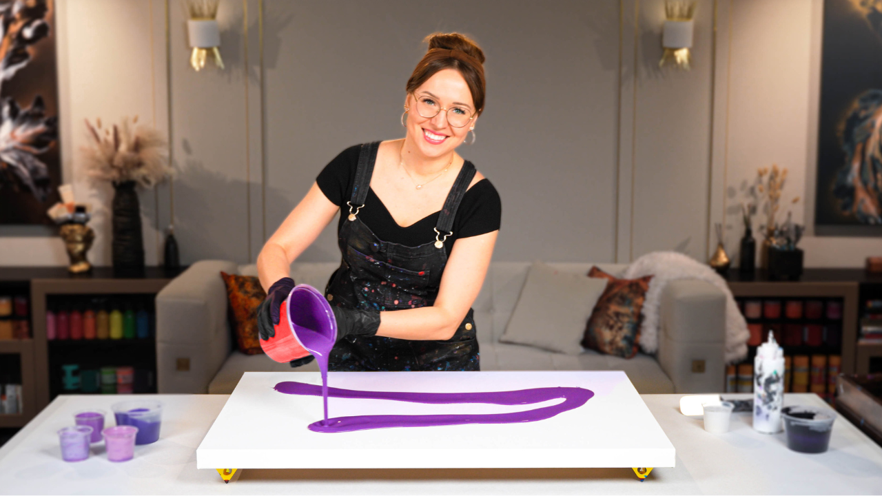
This is the first fluid art painting I created in my new art studio - and it’s a special one. I used the Dutch pour technique on a large canvas, blending ocean-inspired colors with soft silver embellishments for a striking and elegant look. After six years of creating acrylic pouring artworks in my Vancouver studio, this moment felt like both a fresh start and a celebration of how far I’ve come.
Watch the full process here:
For this first project, I knew I wanted to work with something that felt both grounding and expansive, like the ocean. There’s something deeply spiritual about blue for me. It’s calming, but powerful. So, I pulled out all my favorite shades of phthalo blue, turquoise, hints of gray, and, of course, silver.
A few months ago, I did a smaller round canvas with a similar palette, and I loved the energy it carried. This time, I wanted to scale it up.
Bigger canvas.
More movement.
More depth.
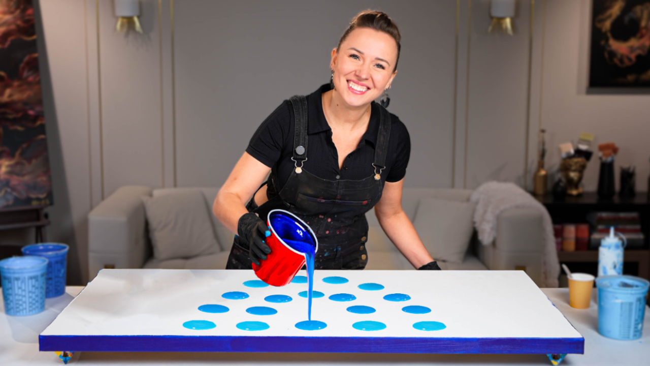
Mixing Ocean-Inspired Colors for an Acrylic Blowout Dutch Pour Technique
I mixed all my colors from scratch, layering different blends of blue, green, black, and white to create soft shifts in tone.
If you’re curious about my pouring recipe and how I mix fluid acrylic to achieve this smooth blending for blowout Dutch Pour techniques, I teach my full method in my Fluid Art Mastery course. Inside, you can find everything from the exact author paint recipe to testing consistency, layering colors to avoid muddiness, and understanding how different paints behave in acrylic pouring techniques.

Adding a Silver Glow – Embellishment and Final Touches
After the blowout dried, I started dreaming up what else this piece could become.
There’s this shimmer of silver in the cells that reminded me of moonlight on water, and I wanted to lean into that glow.
I masked off some of the painting and added silver spray paint in layers, almost like a glaze, to make those areas softly shine. It’s one of my favorite ways to bring out the magic in fluid art without overpowering it.
I also refined the lines created with finger swipes, added soft outlines with Prussian blue, and touched up the edges to keep everything cohesive.
These little adjustments take time, but they make all the difference in how finished a painting feels.
If you're curious about the techniques I use to enhance my pours after they dry, I teach them in Embellishment Mastery. That’s where I break down how to elevate your paintings without losing their natural flow.
What makes this painting extra special to me is how complete it feels. It’s vibrant, but calm. Detailed, but not overwhelming. And I even signed it diagonally – which I never do – because it truly looks beautiful in both portrait and landscape.
It’s the perfect beginning for this new studio chapter.
What do you think? Do you see the movement of the ocean in it, too?
Let me know in the comment section under my YouTube video - I would love hearing your thoughts!
And thank you for joining me on this journey. It means the world!
Struggling with paint that’s too runny, too thick, or just not giving you the reaction you want?
You’re not alone — consistency is the #1 challenge I see for fluid artists. That’s exactly why I put together my free Consistency Cheat Sheet. It’s a quick and practical guide that shows you how to mix your paints for different techniques, so you can finally pour with confidence and get results you love.