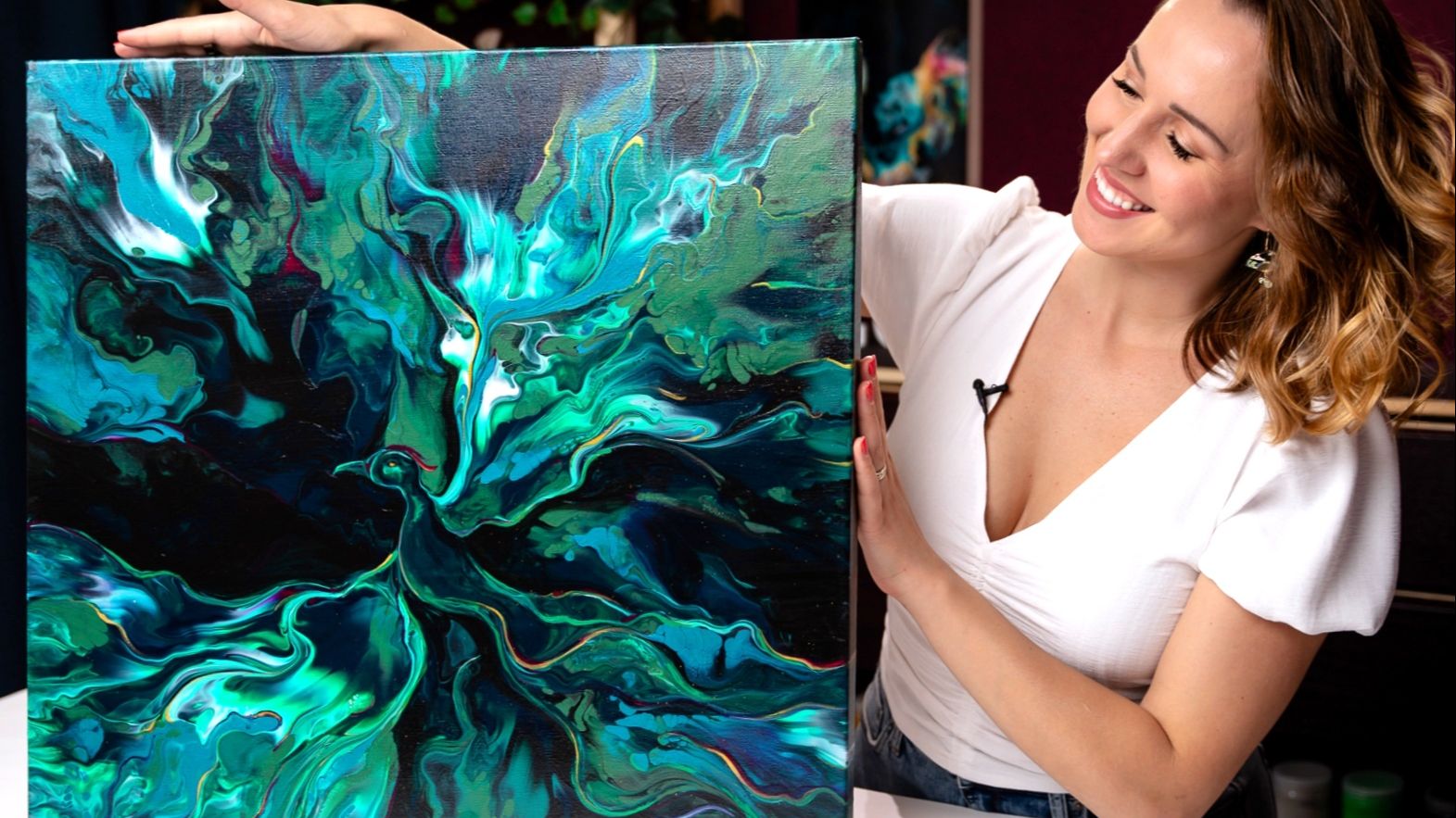
Phoenix Rising Acrylic Pouring - Surprisingly Epic Outcome!
Welcome to a new Phoenix Rising Acrylic Pouring abstract art tutorial, and this one feels especially meaningful. In this abstract painting, I worked with a deep green color palette that’s rich, moody, and full of emotion.
The painting is called Phoenix Rising, and “Prosperity” is the hidden message layered into this artwork. Interestingly, the canvas I started with already had a subtle green tint, so this intention is doubly woven in.
Watch the Full Acrylic Pouring Video:
Layering Greens with Intention
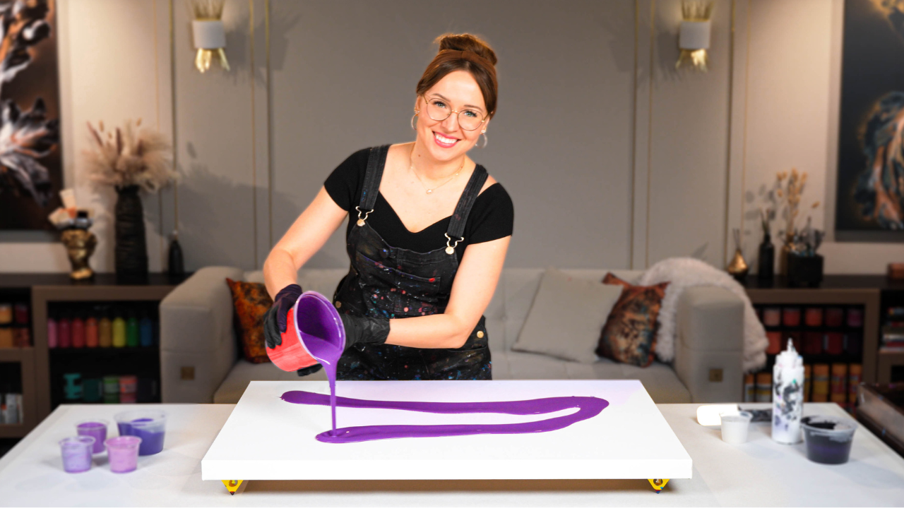
For the base of this piece, I used phthalo green – one of my all-time favorite shades. It leans closer to blue, which gives it a sophisticated, cooler vibe that works beautifully in abstract art. I let it take the lead in this composition, flowing across most of the canvas.
To create more depth, I added a muted green made from phthalo green, white, and a touch of black – soft and slightly grayish. This helped balance the boldness of the main color and gave the painting areas of quiet contrast. In my experience, adding desaturated tones alongside vibrant ones always gives a fluid art painting more atmosphere and dimension.
Acrylic Pouring Recipe Used
To create this painting, I mixed my paints using my signature Soby Recipe – the exact formula I teach inside my Fluid Art Mastery course.
This water-based recipe (approximately 80% water) keeps pouring affordable and accessible, while still delivering professional, archival-quality results. I include a few key artist-grade mediums that:
- Improve the drying process
- Prevent cracking or crazing
- Enhance cell formation and smooth blending
- And avoid non-archival materials like Floetrol, PVA, or silicone
It’s the best of both worlds: artist-grade performance with an easy mixture.
Final Touches – Bringing the Phoenix to Life
Once dry, this painting really transformed. I kept the soft, flowing movement created through the blowout technique, but I also refined the composition with brushwork and finger swipes to enhance direction and form.
What emerged was something that truly surprised me – a phoenix-like form, rising through the movement and color. And while I often say I fall in love with my paintings at the end… this one holds a truly special place in my heart.
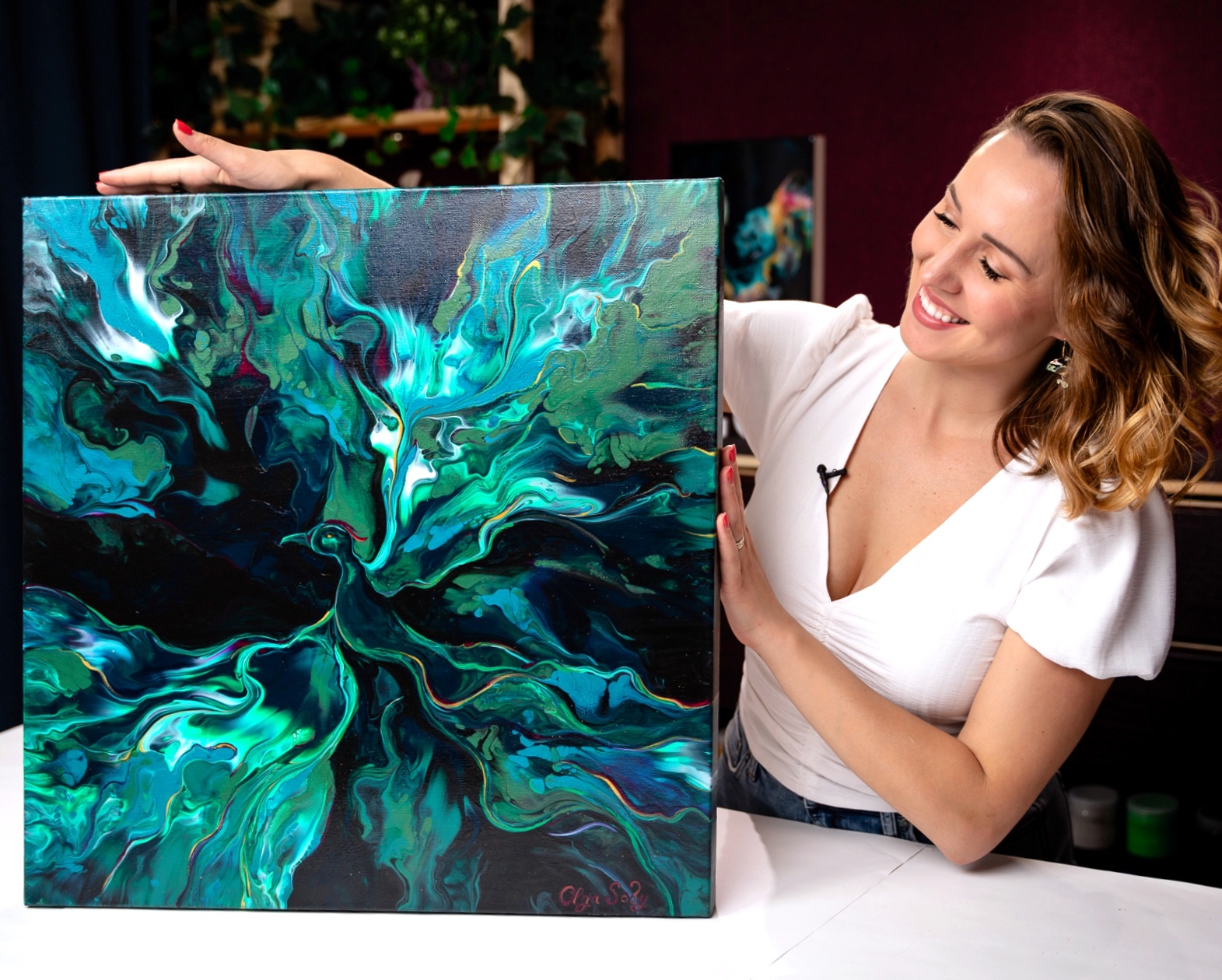
This was one of those rare paintings where emotion, color, and movement came together almost effortlessly. I’m so happy I followed the pull toward green in this piece – it reminded me of how expressive and versatile this color can be in fluid art.
I hope this inspired you to explore new color directions in your own practice. Let me know in the YouTube comments what this painting makes you feel.
Thanks for being here with me on this journey.
Colorfully yours,
Olga Soby
Struggling with paint that’s too runny, too thick, or just not giving you the reaction you want?
You’re not alone — consistency is the #1 challenge I see for fluid artists. That’s exactly why I put together my free Consistency Cheat Sheet. It’s a quick and practical guide that shows you how to mix your paints for different techniques, so you can finally pour with confidence and get results you love.