Top 4 Tips To Tame The Power of Red in Fluid Art – Passion’s Pulse
Red is one of those colors that immediately captures attention. It evokes passion, power, love, and strength..
But in acrylic pouring, red can be tricky. It’s so bold that it often overwhelms everything around it. In this blog post, I want to share how you can harness the energy of red and still create balanced, harmonious compositions in your fluid artwork.
Let’s talk about how to make red work, not just look loud.
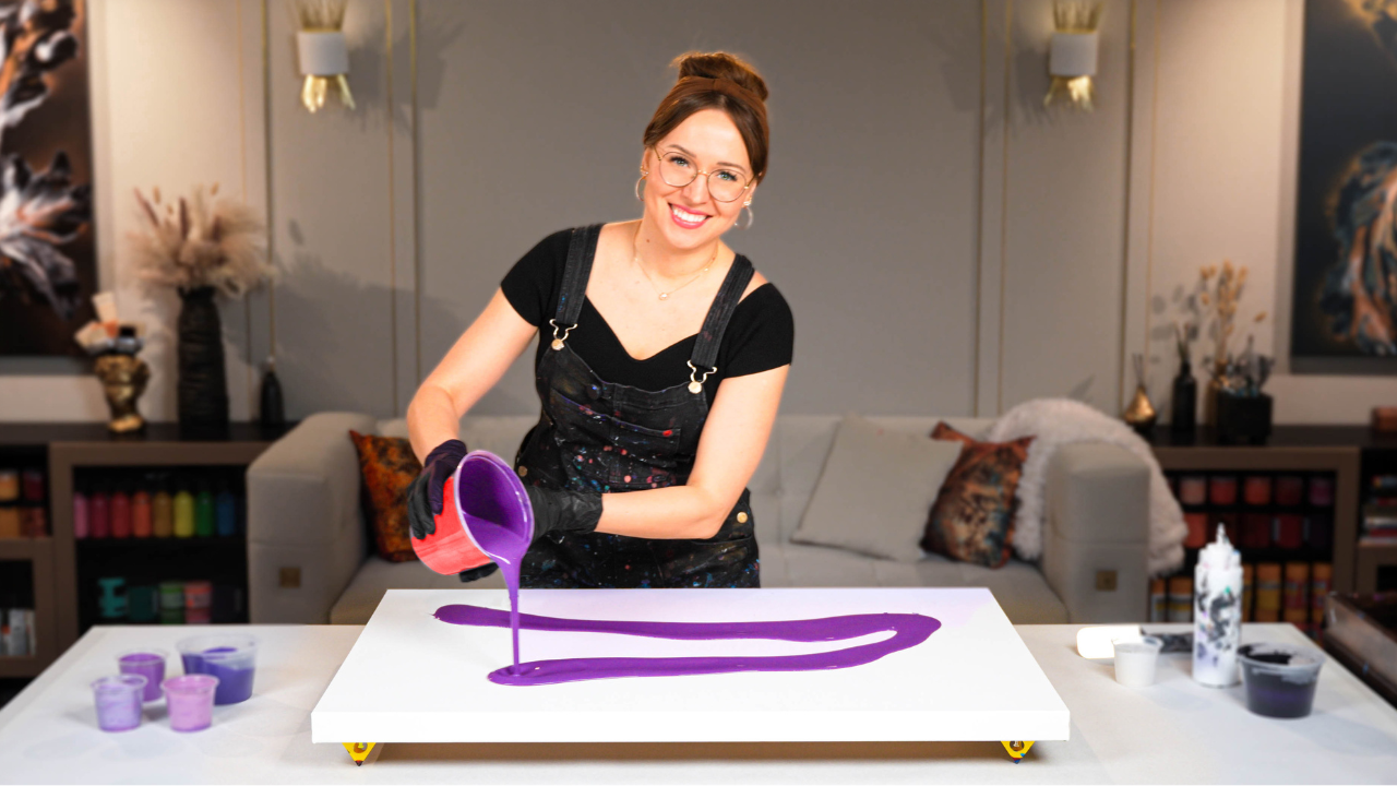
In my painting “Passion’s Pulse,” I intentionally chose a red-dominant palette. This creation is bursting with scarlet, magenta, copper-orange, and gold. But I knew that if I wasn’t careful, all that vibrancy could become overpowering.
Tip #1: Use Negative Space to Give Red Room to Breathe
Red brings drama.
And just like in music or storytelling, drama needs silence to be powerful. In fluid art, that silence comes from negative space.
In Passion’s Pulse, I used a deep, moody base to ground the composition and give the fiery colors a backdrop that makes them shine without overwhelming.
Here’s the full process video for Passion’s Pulse, where I share how I created the energetic blowout composition and added subtle refinements after drying.
This use of negative space allows red to expand upward with confidence, while the viewer’s eye still has space to rest.
Tip #2: Use Neutrals That Support – Not Compete
Neutrals are your secret weapon when working with bold colors like crimson, carmine, or magenta. They help balance intensity, create breathing room, and give your vibrant colors the space to shine.
Classic neutrals, such as white, gray, and black, are always useful. But when used alone, they can sometimes feel too stark.
To create more visual harmony, try incorporating tinted or toned neutrals like:
– Charcoal gray
– Warm brown-black (like burnt umber mixed with a bit of black)
– Soft ivory or cream
– Desaturated indigo or deep navy
– Muted plum or earthy aubergine
In Passion’s Pulse, I created a custom base using black, carmine, and a hint of violet, which dried nearly black but carried a subtle undertone that made the reds above it feel deeper and more refined.
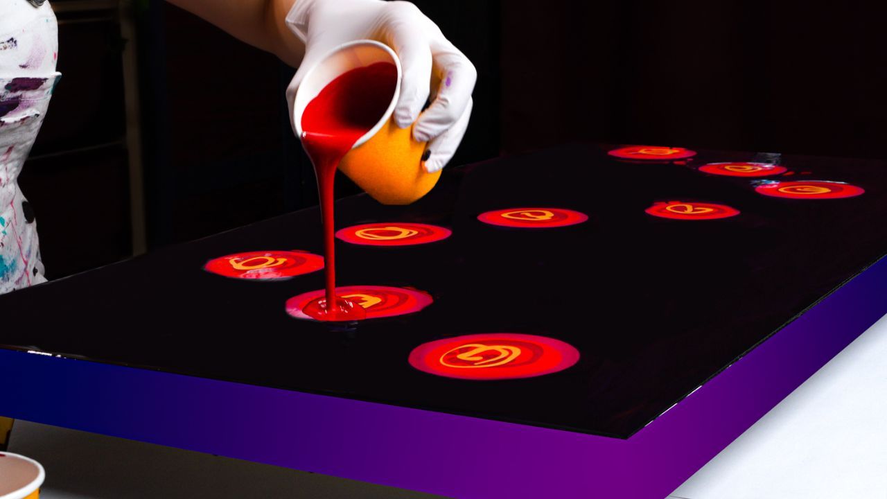
Tip #3 Add Metallics for Balance and Elegance
When using intense pigments like scarlet or magenta, adding supporting metallic colors like iridescent gold or copper can also help you diffuse the intensity of red by catching the light and breaking up areas of solid color.
Even small touches can elevate the entire composition.
In Passion’s Pulse, I used gold as well as blended metallic copper with orange and red to create a softened, earthy tone. These colors add warmth and sophistication while giving the brightest reds a stage to shine.
Tip #4: Keep Your Composition Intentional
When working with bold colors, less is often more, not in color amount, but in directional control.
In this painting, I created a flowing, upward “S” curve movement with layered blowouts. This helped create an expansive, rising energy without letting the composition fall apart into noise. If you’re going for drama in color, aim for clarity in shape.
Red in fluid art doesn’t have to be intimidating. With the right approach, it can be the most expressive and captivating part of your painting.
Let it dance, but don’t let it take over the stage.
Thank you for reading, and I hope this inspired your next creation!
Colorfully yours,
Olga Soby
Struggling with paint that’s too runny, too thick, or just not giving you the reaction you want?
You’re not alone — consistency is the #1 challenge I see for fluid artists. That’s exactly why I put together my free Consistency Cheat Sheet. It’s a quick and practical guide that shows you how to mix your paints for different techniques, so you can finally pour with confidence and get results you love.