Why Violet Is a Power Color in Fluid Art – And How to Use It Right
Violet is a color that stirs emotion, depth, and wonder. In fluid art, it carries a unique duality: soft and mystical, yet dramatic and commanding. This powerful hue often evokes elegance, femininity, spirituality, and even royalty.
But despite its beauty, violet can be intimidating to use – and for good reason.
Many artists avoid it because violet dries darker than expected, can turn muddy if layered poorly, and often loses the luminosity it shows when wet. But with the right approach, violet can be one of the most rewarding colors to work with in your acrylic pouring palette.
Let’s explore why it deserves more love and how you can master its use in your fluid art.
Why Violet Can Elevate a Painting Instantly
From a psychological and symbolic standpoint, violet represents intuition, transformation, mystery, and high ideals. It has long been associated with royalty and luxury, but also with inner reflection and creativity. Used well, it can instantly add sophistication and emotion to a painting.
It also plays beautifully with metallics – especially gold and silver – as well as with both warm and cool tones, giving it an incredibly versatile role in fluid compositions.
But to unlock its full potential, you need to understand how to mix, layer, and highlight it properly.
Tip #1: Warm vs. Cool Violet – Understand the Spectrum
Not all violets are created equal. Some lean toward magenta and red, creating a warmer, more romantic vibe. Others veer toward blue, offering a calmer and more contemplative feeling.
Here are a few examples:
Warm Violets: Quinacridone Violet, Permanent Magenta, Cobalt Violet Hue
Cool Violets: Dioxazine Purple, Ultramarine Violet, Blue-Violet mixes
If you’re creating a gradient or working on a multi-layer pour, you can create stunning effects by transitioning gradually between warm and cool violets.
Tip #2: Prevent the "Drying Disappointment"
One of the most frustrating aspects of working with violet is how drastically it can darken once it is dry. That glowing lavender or vibrant plum can easily shift into a muddy purple or even appear black.
Here’s how to preserve depth and dimension:
Pre-lighten: Mix your violet with a small amount of titanium white.
Highlight Strategically: Use white, gold, or even warm pastels near your violets to create contrast and prevent a "flat" look.
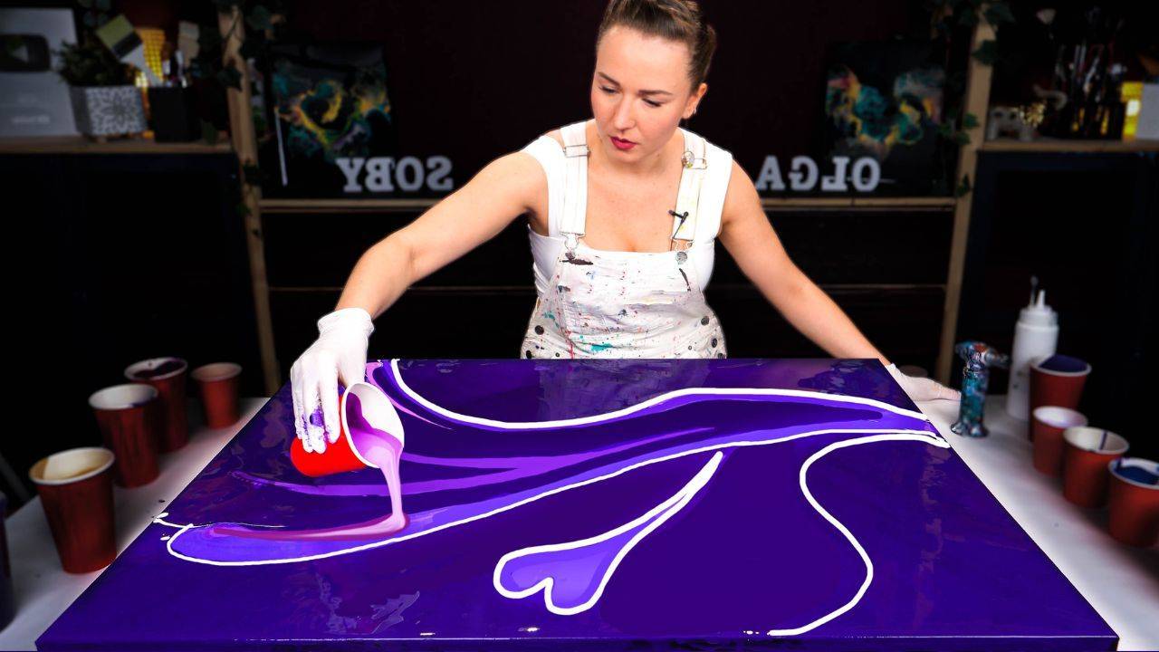
Tip #3: Add Depth with Gold Accents
If violet is mystery, gold is light. Adding gold to violet-based paintings can instantly elevate the elegance and bring balance. In the painting featured in the video below, I created a glowing "golden core" that gave structure and luminosity to the otherwise deep violet flow.
Try adding deep gold veins with finger swipes and splashes of metallics using masking and spray techniques.
These touches of brilliance make your violets shine – literally and figuratively.
Watch How It All Comes Together:
Don’t be afraid of violet – embrace it. It may require a bit more planning and testing than other colors, but when used with intention, it can completely transform your artwork.
So if you’ve been craving something a little different, why not give violet another try in your next pour? Explore the spectrum, play with accents, and trust your instincts.
And if you do, I’d love to hear from you. Let me know how it went by sharing your experience or thoughts in the comments below the video on YouTube!
Colorfully yours,
Olga Soby
Struggling with paint that’s too runny, too thick, or just not giving you the reaction you want?
You’re not alone — consistency is the #1 challenge I see for fluid artists. That’s exactly why I put together my free Consistency Cheat Sheet. It’s a quick and practical guide that shows you how to mix your paints for different techniques, so you can finally pour with confidence and get results you love.