Yin Yang Meets Infinity Symbol – Fluid Art by Olga Soby
Fluid art meets sacred geometry in this mesmerizing black and white abstract painting. In this tutorial, I explored a bold new layout combining two powerful visual symbols: Yin Yang and the infinity symbol. The result? A high-contrast fluid painting with rich metallic embellishments, expressive color bursts, and a deeper message of balance and continuity.
“Equilibrium” is the secret message hidden in this painting – a reminder to center ourselves amidst chaos, to honor both movement and stillness, and to embrace both light and dark.
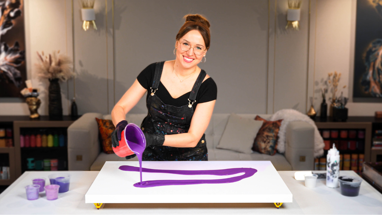
For this composition, I used a 20-inch round canvas with a black-and-white color-split base. The black side was created using a custom blend – not pure black – to avoid flatness and give more depth and subtle undertones. I then used a large metal ring to shape a double loop, blending the idea of Yin Yang and infinity. It's a technique I’ve developed over time, and each time I push it a bit further.
On top of this dynamic base, I added a flowing burst of metallic and iridescent colors:
- Permanent Red-Purple – a bold, bright magenta for passion
- Iridescent Gold – a warm, glowing metallic by Pebeo
- Copper-Orange Mix – created from iridescent orange and copper for a fiery metallic accent
These colors pop brilliantly against the neutral background, giving the painting an almost glowing energy.
Acrylic Pouring Recipe Used
All paints in this artwork were mixed using my brand-new signature pouring recipe, which I teach step-by-step in the Fluid Art Mastery course. This recipe is water-based (around 80%) and includes a custom blend of archival-quality mediums that:
- Improve drying performance
- Prevent cracking and crazing
- Enhance layering and flow
- Help achieve stunning cell formation
It’s designed to stay affordable while delivering gallery-worthy results – without using Floetrol, PVA, or silicone.
Once the painting was dry, I enhanced the white arc of the infinity ring by hand for balance and symmetry. A few finger swipes and touch-ups helped refine the composition without overworking it. Finished with a glossy varnish, “Equilibrium” truly glows – especially where the iridescent colors dance over the black base.
And here’s a fun twist – this painting works in multiple orientations! I’d love to know which one you like best. Check out the tutorial and leave a comment with your favorite layout.
Thank you so much for joining me in this creative journey!
Colorfully yours,
Olga Soby
Struggling with paint that’s too runny, too thick, or just not giving you the reaction you want?
You’re not alone — consistency is the #1 challenge I see for fluid artists. That’s exactly why I put together my free Consistency Cheat Sheet. It’s a quick and practical guide that shows you how to mix your paints for different techniques, so you can finally pour with confidence and get results you love.